[IMPLEMENTED] Cards UI improvement - easier to read when using loads of cards

Hi,
First of all, thanks for such a cool tool! :slight_smile:

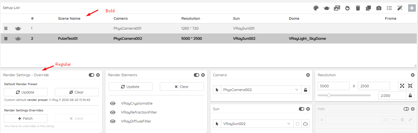
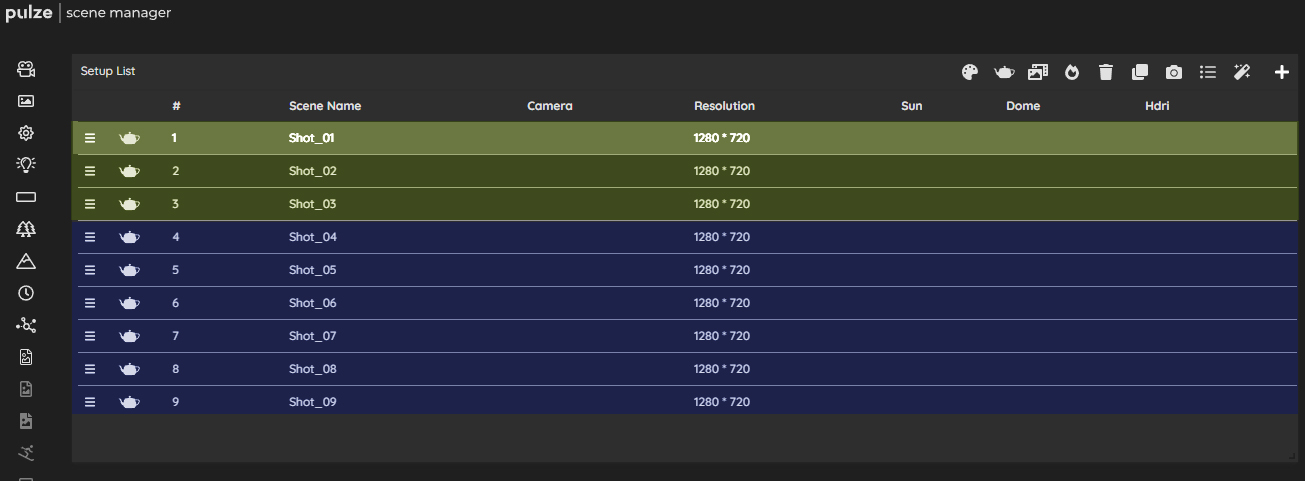
I find it a bit hard to read and find specific cards when scrolling down through a lot of them which is quite common. I was was wondering if there is any colour-code or something that could be implemented UI-wise to make this easier? I had a quick go at it with photoshop and it instantly helped, but I ain’t a UX/UI designer so these are most likely terrible XD. It is just to illustrate my point.

Maybe this is something that could be optional for the users to choose what “skin” to use? The icons on the left toolbar could have a small coloured vertical bar (similar to what the scenes have) that follows the same colour code to also make it easier for new users to know what icon represents what card. Hope this helps!
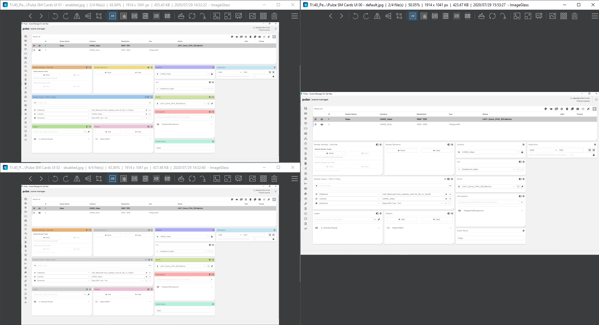
Right: current UI
Top-Left: all enabled
Bottom-Left: some disabled

P.S.: sorry for the screengrab, it’d only allow me to upload one image as this is my first post

Hi,
Thank you very much for the great idea and for the helpful screenshot. This should not be too hard to implement so we will put it on our feature list and we will keep you updated. :slight_smile:

1 Like

That’s great, thanks @peter.sarhidai
In case it helps, I was actually just talking about the Scene Manager with a colleague and he suggested that having the ability to “roll-up” or minimise cards when not in use would help with this too and I thought it was a good shout!

Cheers,
Lautaro

Sorry for so many replies, but another thing a colleague mention is that the item titles are in bold for the “Setup List” module which makes it easy to read but the titles of the modules are just regular (see attached). Having them all in bold might help its readability a bit as well when scrolling through the different modules.

1 Like

I would like to share 2 other ideas.

Could you make the coloring of cards more intense, right now we have a couple of pastel colors, which pretty much look the same.
And would it be possible to deactivate a couple of shots an make them appear dark, if you decide you dont work on them for a while?

Hi Florian,

Thanks for the idea! To have more vivid colors is totally doable. Since it is in alignment with others requests we will take care of this in the next update.
To “deactivate” a shot, it is a little bit more complicated technically. Could be enough for you if one of the selectable color schemes is a light grey one?

Cheers,

Attila